
Your website may look nice on a large screen but what about a mobile device? Mobile-friendly websites aren’t a new concept nor is browsing the web on a portable device however until recently the majority of traffic still came from devices with larger screens and traditional input devices like a mouse and keyboard. That balance has shifted with mobile traffic taking the lead. Having a mobile-friendly website isn’t really optional anymore. With that in mind, let’s take a look at how you can test your current site to see where you stand and what steps you can take to either create a mobile version of your existing site or build a new one with mobile in mind.
What does mobile-friendly mean?
Before we get started, let’s make sure we’re clear on what having a mobile-friendly website really means. You may have heard of concepts like mobile-first or responsive web design or a dedicated mobile version of a website. These all refer to some version of any given website that was designed with mobile devices in mind.
Responsive design uses techniques to determine what size screen the visitor is using and adjusting the content accordingly. It is essentially the same version of the overall site that “responds” to a particular screen size so that it can be easily viewed on any device.
Another option is a dedicated version of the website that mobile users are redirected to when visiting the main site. It is generally a completely different version of the site, the major disadvantage of which is needing to maintain multiple versions of content and other resources.
We prefer responsive design for simplicity and consistency and recommend that any new project take this approach.
Why is this important to me?
Recent internet traffic studies show that people now visit websites more often from phones and tablets than from computers. Mobile browsers have gotten much better, screens are larger and easier to read and mobile internet speeds have greatly increased. Data plans are more generous than ever and people are generally more mobile than they used to be. All this adds up to more people visiting your website or, at least trying to, on smaller devices.
And therein lies the potential problem. People expect your website to work on their mobile device and in many cases won’t even bother trying to use it if it isn’t. Imagine a potential customer has taken the time to search for your business and loads your site to find out where you are or how to get in touch with you. How easy is that for them to do? Can they read the text on the screen? Is your contact information front and center for them to access? If they have to pinch and zoom or navigate to numerous different pages the answer is no.
Another key consideration is how search engines rank websites based on mobile friendliness. Google’s mobile search results now place mobile-friendly websites higher than non-friendly ones. Combine this with them ranking sites that load faster higher than ones that don’t and suddenly having a heavy, desktop-only website becomes a liability.
Myths about mobile sites
Myth – You have to create a new website if your current site isn’t mobile-friendly.
Truth – That is not necessarily true but may ultimately be a better solution than bolting on a mobile version. There are ways to create an alternate mobile version of a website as mentioned above that may be more cost-effective. Consider this more of a workaround than an actual solution. You should definitely insist that any new site be built using responsive design principles.
Myth – A mobile website is a separate development effort or process so it will cost more.
Truth – Any new website should be built with responsive design in mind. There is an even more focused approach called mobile-first and progressive enhancement which focuses on the key content that must be included on any given page, presents that to a mobile device and then progressively includes more content as the screen size increases. In either case, these principles should just be part of the design process, not seen as an extra additional service.
How to test your site
There are numerous ways that you can test your current website but I’ll mention two here. The first is to go to it yourself on your own mobile devices. I’ll just assume you have a smartphone and possibly a tablet as well. Visit your site and browse around. How easy is it to view? Can you find the basic important information about your business?
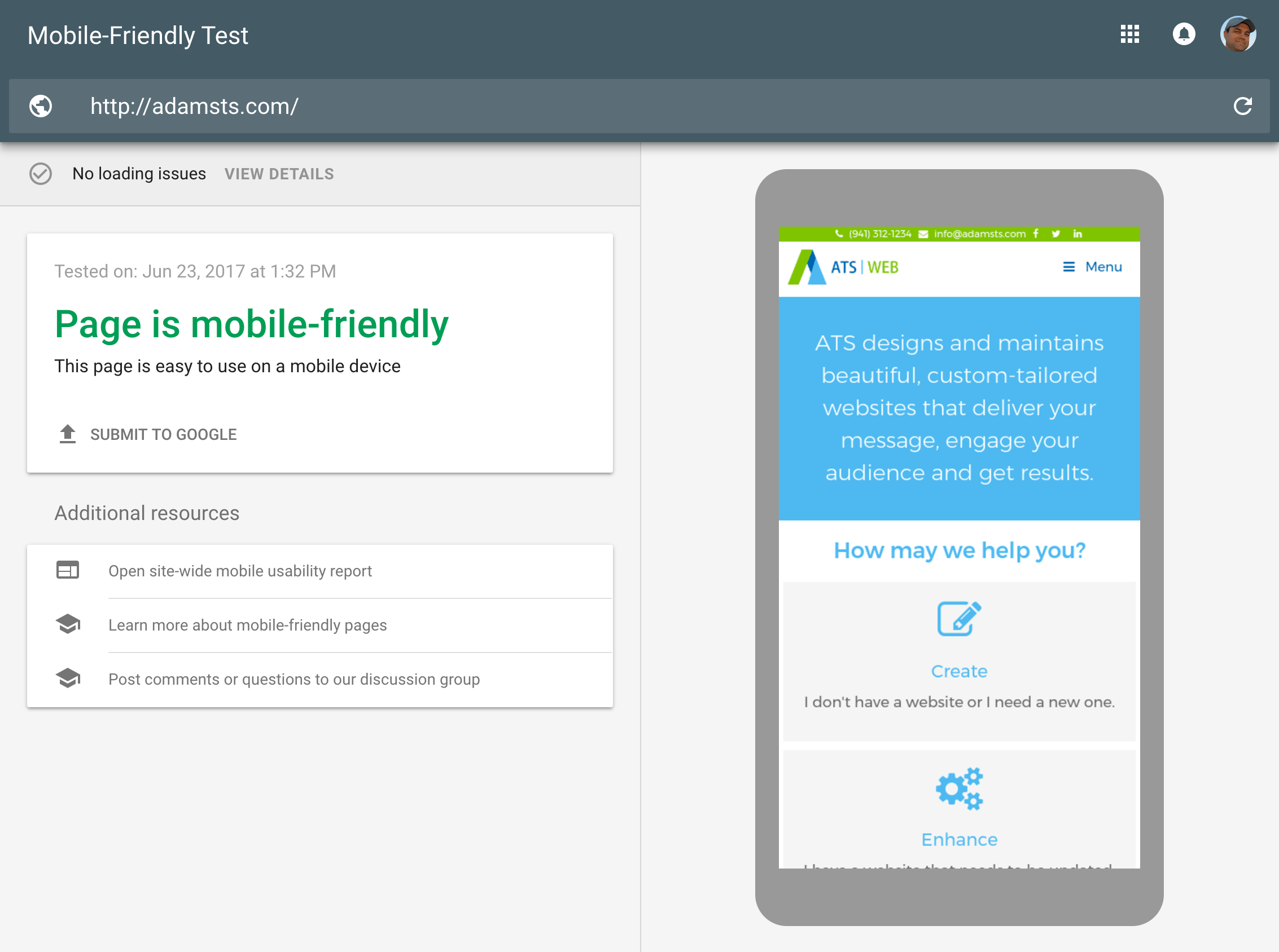
Another option is Google’s Mobile-Friendly Test. Enter your site’s address and submit. The page will refresh and give you a report of whether your site is considered mobile friendly. Here’s a sample of what that looks like using this site.
If your site is not considered mobile friendly the page will explain why that’s the case and provide suggestions on how to improve the rating. Some of these suggestions may be straightforward to implement while others could require a larger effort to correct. This larger effort could mean that your current site can be enhanced to include responsive design or getting an alternate mobile version in place. Depending on the age of your site it may be more efficient to simply redesign it from scratch.
Tips for implementing mobile-friendly features
Here are some general Do’s and Don’t’s when it comes to making changes for mobile.
[icon name=”check-circle-o” class=”” unprefixed_class=””] DO focus on the key content that a mobile visitor is likely to need quick access to. This includes important information like your location and directions, contact information such as phone and email as well as highlighting key services.
[icon name=”ban” class=”” unprefixed_class=””] DON’T include every piece of content that the desktop version of the site would have, particularly heavy content like slideshows, video, animations and graphics. The two main reasons for this are page loading speed and simplicity of layout. That said, this content is fine to include if it is secondary and doesn’t cause excessive page load times or interfere with a user’s ability to access key information. Something to keep in mind is that although you may have a 4G/LTE connection on your newer smartphone not everyone does. The lighter and faster the page the better.
[icon name=”check-circle-o” class=”” unprefixed_class=””] DO make your navigation simple and easy to use. Consider using alternate navigation for mobile with only the key areas of the site listed at the top level.
Wrapping up
Let’s take a moment to summarize.
Your site should have some means of being mobile-friendly, preferably by having been designed with responsiveness in mind from the start. If that’s not possible there are other options that can be bolted on.
You should know if your site is mobile-friendly. If you don’t, test it using the methods described above.
Use the tips provided to decide how best to implement a mobile-friendly version of your site. If these are things you are capable of and comfortable doing, great! If not, we at ATS Web are experts at designing responsive websites and would be delighted to work with you on fixing your current site or designing your next one. Please contact us for an evaluation of your current site and we can help advise you on how best to accomplish your goals.
We love hearing from our readers. If you have any questions or comments on this article please leave them below in the comments section.
Lastly, if you enjoyed this article and would like to receive more tips like these please sign up for our mailing list using the form below.